What are Bullet Graphs and where are they used?
Key data overviews on dashboards are easier to understand by visualisation. The realisation is quite difficult, because standardised diagrams are uneligible for this function. Bullet Graphs, a special type of bar diagrams, have been especially developed by Stephen Few. Basically they are very suitable for those purposes, but they hold some disadvantages in its common form (see illustration 1 and 2), which we have solved in our projects due to a modified, optimised form of visualisation.

Illustration 1: The components of a Bullet Graph as it is regularly used in dashboards
- Bullet Graphs are a special form of bar diagrams
- They compare a presented key figure with a target value
- By using background colours, additonal information of quality will be allocated
- Bullet Graphs are often used in dashboards. They save space and replace tachometer
- Bullet Graphs can be aligned horizontally or vertically
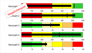
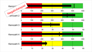
Illustration2: Dashboards with Bullet Graphs as they are often recommended and used
5 disadvantages of this Bullet Graph illustration
- The graphics become confusing very quickly, because many detailed information is shared, which is not necessarily needed or partly not available at all. For example the quality statement “bad, okay, good”. This disadvantage mainly occurs when many Bullet Graphs are displayed on one page (list of key data).
- Variations of the goal are not visualised and therefore difficult to see. The only part easy to read is, if the bar of the just value is overstepping the target value. For the viewer it still would be important if the overstepping is good or bad and how large the variation is.
- Coloured background areas distract the viewer from the main information, which is the bar of the just value and the target value. The coloured areas always look the same, no matter if the goal was reached or not. They rather disrupt the perception than to support it.
- Background areas decrease the contrast towards the bar of the just value and target value. Thus, these essential graphical elements are difficult to see in the front.
- Target areas are difficult to illustrate. In practice there are not only set target values (single values) for key data but often also for target areas. With this key data (KPI) the goal is considered achieved as long as the just value is between the minimum and maximum level of the target area.
How to ideally use the idea of Bullet Graphs in dashboards
For the use in dashboards we use a specially optimised form of Bullet Graphs (Illustration 3), which avoid the named disadvantages and bring additional visual features.
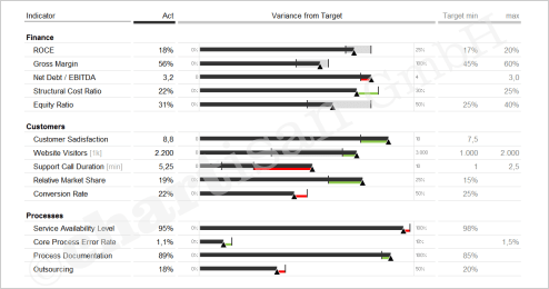
Illustration 3: Dashboard with Bullet Graphs recommended by chartisan
- The simplified illustration without unnecessary background areas allows a quick overview
- Indicated are the target values (single values) or target value areas (minimum/maximum level)
- Variations will be highlighted in colours: positive (desired)= green, negative (undesired) = red. The extend of the variation is easily captured. Viewers immediately see where there is “a lot” red or green flashing.
- The value caption is space-saving and clearly stored within the columns of the chart.
- This optimised graphic form uses the strengths of the original Bullet Graphs and complements them with a visual drift indicator. The detail level has been reduced as much as possible, whereby these optimised Bullet Graphs are ideal for lists of key data.
By the way, we have managed and automised the displayed example with some tricks in Excel. As often the idea was key not the tool. Having said this, we hopefully could inspire you. Should you look for further good ideas for your reporting, contact us!