Tag Archive for: Dashboard @en

One of our previous posts discussed small multiples, i.e. a series of charts consisting of several small charts of the same type. It also describes conceptual considerations on typical application scenarios involving small multiples.

This post introduces an alternative method which you can use to create small multiples for simpler application scenarios at the blink of an eye. This type of alternative is especially interesting if the speed of implementation is more important that a special, individual chart design.

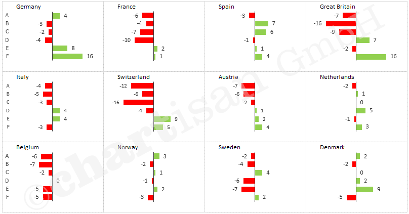
The idea: Excel sparklines are ‘opened up’ into a small multiple.

Sparklines are very simple diagrams nested within a single cell. Generally speaking, several of these charts are bundled together in a group, for which certain properties are defined, e.g. column colour or axis length. Use the following steps to transform standard sparklines into small multiples in a matter of minutes.

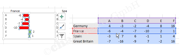
  • “Insert” menu -> Sparklines -> Column / select data and location range so the sparklines appear next to the input area for the values
  • Link the first sparkline with the first country name / copy the formula downwards for the other sparklines

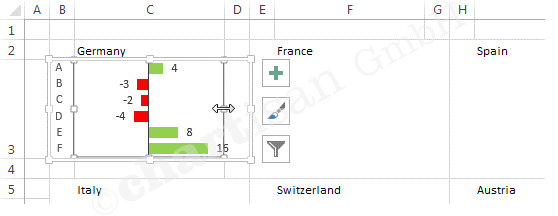
  • Move the cells with sparklines into a cell range with the desired layout

The interim result doesn’t provide a good overview over the data yet because Excel automatically displays each sparkline with an individual axis. Therefore, the charts need to be given a standardised axis using the following option:

  • Click on a sparkline / “Design” menu -> Axis / set Minimum and Maximum value to the same for all sparklines

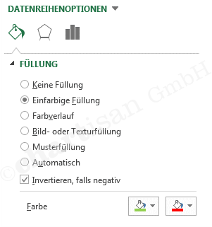
To increase the informational value, if required, you can also automatically display certain columns in a different colour, e.g. High Point and Last Point.

Done 🙂


Labelling data points in charts is generally more reader-friendly than using a vertical axis. The axis is automatically displayed in Excel, and therefore it is often found in reports and presentations. However, it forces the chart reader to move their eyes back and forth between the data points and the axis.

If data points are labelled directly, on the other hand, the reader’s eye can rest steadily on the data points. That way, readers of your charts can concentrate on the content (!). Unfortunately, standard labelling options in Excel are often too inflexible, and the results are quite ugly. In line charts, for example, there are often overlaps between label and line, and in the worst case, they are no longer legible.

Excel does offer different label positions (top, bottom, right, left, centred). But these are always applied to all data points at once, although an individual alignment per data point would make more sense. Of course, you can also move the labels manually. But this can also lead to problems, as the manual position also needs to be changed by hand after data updates.

A little trick provides the solution: an invisible auxiliary data range can be used to generate data labels that always position themselves correctly. In the case of a line chart, you can have it calculate whether it ‘bends’ up or down for each point. The formula then compares each data point with the median value of its two neighbours. Of course, you may have to use completely different formulas for different chart types.

Use the following steps to create clever labels for line charts:

  • Create a formula to move the label up (+1) or down (-1)
  • Calculate auxiliary data range “Label” for data labelling (at the points level)

  • Add data range “Label” to the diagram, make points and connecting lines invisible and insert centred data labels

  • Click the first label field of the new data range twice (don’t double click), so that the individual label field is selected
  • Type “=” and click on the table cell showing the value to be displayed (e.g. the value for January), then confirm with enter (this creates a so-called linked label)
  • Link the other data points with the corresponding table cells

Done 🙂

Tip: Excel Version 2013 introduced the labelling option “Value From Cells”, with which you can achieve the desired result much quicker.


“Small multiples” are charts that display a range of data in several smaller charts of the same type. This is often easier to read than mixing the same data in a single, more complex chart. The informational value and overview are the result of the aggregate charts in this case.

The specific application scenario determines whether to use a small multiple or a single chart with several data ranges. Stacked column or bar charts visually highlight the sum. Small multiple charts place the visual focus on the individual data ranges.

If the company revenue is displayed as a stacked bar chart (1 chart with 4 data ranges), for example, then total revenue is easy to see, but less so the precise development of individual product groups.

On the other hand, if 4 single charts (with one data range each) are displayed for the product groups, then revenue performance for each product group can easily be gauged. Additional details such as deviation indicators can easily be implemented at the product group level.

To maintain a good overview, however, you need to standardise the individual charts making up the small multiple. A consistent axis scale is especially important. Highlighting improves the informational value, e.g. using the signal colours green and red to mark positive (desired) or negative (undesired) deviations.

Unfortunately, this type of chart isn’t part of Excel’s native functionality. Nevertheless, you can easily implement custom small multiples in just a few steps.

Create Chart

  • Chart Type: Cluster Bar
  • Data ranges: main data range and min/max data range for a consistent axis scale

Format chart

  • Add Data Labels
  • Format Data Series… Series Overlap: 100% / Gap Width: 50% / bar colour: Solid Fill = green, Invert if negative, second colour = red / min/max colour: no fill

  • Format Axis… Axis Options: Values in reverse order / Line: Solid Line, black / Label Position: Low
  • Format Chart Area… Fill: No fill / Border: No line / Font size: 8 pt

Position chart

  • Align chart area (outside) and drawing area (inside) to the cell using the Alt button

Copy charts

Adjust the data source for each chart

Done 🙂

Tip: In one of our next posts, we’ll be presenting a second way of realising small multiples even quicker for simple application scenarios.


What are Bullet Graphs and where are they used?

Key data overviews on dashboards are easier to understand by visualisation. The realisation is quite difficult, because standardised diagrams are uneligible for this function. Bullet Graphs, a special type of bar diagrams, have been especially developed by Stephen Few. Basically they are very suitable for  those purposes, but they hold some disadvantages in its common form (see illustration 1 and 2), which we have solved in our projects due to a modified, optimised form of visualisation.


Illustration 1: The components of a Bullet Graph as it is regularly used in dashboards

  • Bullet Graphs are a special form of bar diagrams
  • They compare a presented key figure with a target value
  • By using background colours, additonal information of quality will be allocated
  • Bullet Graphs are often used in dashboards. They save space and replace tachometer
  • Bullet Graphs can be aligned horizontally or vertically


Illustration2: Dashboards with Bullet Graphs as they are often recommended and used


 5 disadvantages of this Bullet Graph illustration

  • The graphics become confusing very quickly, because many detailed information is shared, which is not necessarily needed or partly not available at all. For example the quality statement “bad, okay, good”. This disadvantage mainly occurs when many Bullet Graphs are displayed on one page (list of key data).
  • Variations of the goal are not visualised and therefore difficult to see. The only part easy to read is, if the bar of the just value is overstepping the target value. For the viewer it still would be important if the overstepping is good or bad and how large the variation is.
  • Coloured background areas distract the viewer from the main information, which is the bar of the just value and the target value. The coloured areas always look the same, no matter if the goal was reached or not. They rather disrupt the perception than to support it.
  • Background areas decrease the contrast towards the bar of the just value and target value. Thus, these essential graphical elements are difficult to see in the front.
  • Target areas are difficult to illustrate. In practice there are not only set target values (single values) for key data but often also for target areas. With this key data (KPI) the goal is considered achieved as long as the just value is between the minimum and maximum level of the target area.


How to ideally use the idea of Bullet Graphs in dashboards

For the use in dashboards we use a specially optimised form of Bullet Graphs (Illustration 3), which avoid the named disadvantages and bring additional visual features.


Illustration 3: Dashboard with Bullet Graphs recommended by chartisan


  • The simplified illustration without unnecessary background areas allows a quick overview
  • Indicated are the target values (single values) or target value areas (minimum/maximum level)
  • Variations will be highlighted in colours: positive (desired)= green, negative (undesired) = red. The extend of the variation is easily captured. Viewers immediately see where there is “a lot” red or green flashing.
  • The value caption is space-saving and clearly stored within the columns of the chart.
  • This optimised graphic form uses the strengths of the original Bullet Graphs and complements them with a visual drift indicator. The detail level has been reduced as much as possible, whereby these optimised Bullet Graphs are ideal for lists of key data.


By the way, we have managed and automised the displayed example with some tricks in Excel. As often the idea was key not the tool. Having said this, we hopefully could inspire you. Should you look for further good ideas for your reporting, contact us!


Ein kleiner Projekt-Einblick in ein übersichtlich aufgebautes Sales Dashboard. Durch die Realisierung in Excel, ohne etwaige Plugins oder VBA-Programmierung, lässt es sich komplikationslos von jedem Office-Anwender nutzen und verteilen. Die Datenaufbereitung basiert in diesem Beispiel auf Pivot-Tabellen. Eine Datenbank-Anbindung ist problemlos möglich. Das ist keine Zauberei oder ewige Tüftelei. Versprochen! Wenn Sie unsere Lösung interessiert, […]