Management accounting analyzes, plans and informs. This requires a reliable database, but also flexibility in designing reports, presentations and dashboards. These requirements often can´t be combined in a software system. The discussion about the authorization of local reporting solutions, that complement central standard systems, is currently up-to-date. The article reports from practice and conveys the advantages and disadvantages of local solutions.
Central versus local reports
When I wrote ‘local report solutions’, I could already hear the prompt “think big or go home”. It seems that the management accounting is focusing on big data and the big BI solution. But what is the true situation? What experiences we make in our projects?
The utopia of the one system into which all the data flows and from which rapidly different reports can be generated to steer the entire enterprise, is the driving force of many positive, important developments. But the resource expenditure behind this idea ist enormous. This type of reporting is made practical by a high degree of standardization and continuity. Data collection and storage benefits from the general conditions.
However, the reports and presentations that provide centralized systems are limited by these conditions. They are not very variable and can only help partially in answering non-standardized questions.
Automated, local reporting tools can overcome these communication hurdles.
Therefore they are a flexible and cost-effective alternative. From our projects we know that a mix of central and local reporting solutions is the best course of action.
The local solution isn´t so local
At this point it is important to split the management accounting IT. The topics of data collection and storage are to be separated from the communication of the results, the reporting. Collecting data in isolated applications must be called into question for many reasons. Each BI vendor can name these reasons. However, automated local tools solve many issues when creating reports and presentations.
Strictly speaking, local reporting tools are hybrids. The data they access is usually from centralized systems. The reporting is done in front-end tools that are individually designed and managed locally. The distribution of reports can also be automated and is not particularly limited.

The right time for individual reporting tools
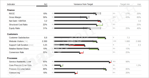
Use custom reporting tools when management often needs to change report variants. They make sense if structured data from the DataWarehouse are to be supplemented with unstructured, individual comments and explanations.
In strategic management, variable reporting and presentation tools make sense in every case. But operational management also raises questions that can only partially be answered by centralized reports.
Resource requirements
There is a catch. As a rule, locally generated reports can´t created quickly. The efficient creation of local reporting tools usually requires a very long learning period.
The design and planning process requires fewer reconciliations and compromises between the report creator and the report recipient. That’s positive. The technical and creative implementation requires a lot of know-how. Specialized knowledge is needed that has little to do with management accounting in a business sense.
Knowledge of the data connection, automation and programming are essential. If the visual presentation and presentation should be efficient and at high quality standards, an above-average user knowledge is necessary.
An idea, if own resources are missing
But even without a resource pool of its own, the advantages of local reporting tools are easy to exploit. The development of such tools is an individual service for which there are different solution providers on the market. These are not software providers, but experienced service providers with special management accounting know-how and relevant experience in the field of reporting.
Good service providers provide a very high quality standard that meets your individual conceptual and technical requirements.
They work directly with the specialist departments in manageable project periods and deliver immediately ready-to-use solutions.
chartisan is one of these solution providers. Our focus is the Management Information Design with IBCS® and the technical implementation with the possibilities of Microsoft Office (Excel, PowerPivot, Power Query, PowerPoint) and Power BI.
Advantages and disadvantages at a glance
You have little time? Therefore is here a clear plus-minus list:
+ Local reporting tools allow variable reporting and presentations.
+ These reporting tools can efficiently display structured and unstructured data.
+ Local reporting tools are ready for use in short time.
+ Through the high degree of automation, the tools support the operative controlling routine.
+ You can buy suitable solutions externally as a targeted supplement to the standard systems.
– Through internal development you tie up important resources, time and financially.
– When using external service providers, you buy foreign competences.
– External service also costs money.
Are there any questions left? Need a hint? You are welcome to leave a comment here or to contact me confidentially by e-mail.
Happy reporting,
Yours Silja Wolff