Tag Archive for: Excel @en

Labelling data points in charts is generally more reader-friendly than using a vertical axis. The axis is automatically displayed in Excel, and therefore it is often found in reports and presentations. However, it forces the chart reader to move their eyes back and forth between the data points and the axis.

If data points are labelled directly, on the other hand, the reader’s eye can rest steadily on the data points. That way, readers of your charts can concentrate on the content (!). Unfortunately, standard labelling options in Excel are often too inflexible, and the results are quite ugly. In line charts, for example, there are often overlaps between label and line, and in the worst case, they are no longer legible.

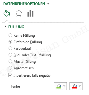
Excel does offer different label positions (top, bottom, right, left, centred). But these are always applied to all data points at once, although an individual alignment per data point would make more sense. Of course, you can also move the labels manually. But this can also lead to problems, as the manual position also needs to be changed by hand after data updates.

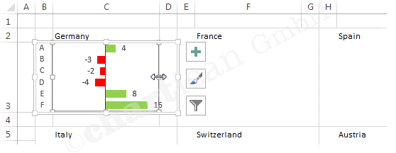
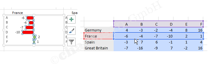
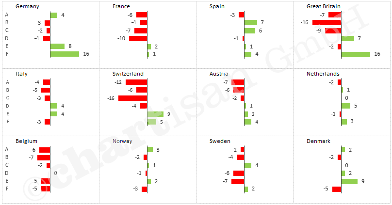
A little trick provides the solution: an invisible auxiliary data range can be used to generate data labels that always position themselves correctly. In the case of a line chart, you can have it calculate whether it ‘bends’ up or down for each point. The formula then compares each data point with the median value of its two neighbours. Of course, you may have to use completely different formulas for different chart types.

Use the following steps to create clever labels for line charts:

  • Create a formula to move the label up (+1) or down (-1)
  • Calculate auxiliary data range “Label” for data labelling (at the points level)

  • Add data range “Label” to the diagram, make points and connecting lines invisible and insert centred data labels

  • Click the first label field of the new data range twice (don’t double click), so that the individual label field is selected
  • Type “=” and click on the table cell showing the value to be displayed (e.g. the value for January), then confirm with enter (this creates a so-called linked label)
  • Link the other data points with the corresponding table cells

Done 🙂

Tip: Excel Version 2013 introduced the labelling option “Value From Cells”, with which you can achieve the desired result much quicker.


“Small multiples” are charts that display a range of data in several smaller charts of the same type. This is often easier to read than mixing the same data in a single, more complex chart. The informational value and overview are the result of the aggregate charts in this case.

The specific application scenario determines whether to use a small multiple or a single chart with several data ranges. Stacked column or bar charts visually highlight the sum. Small multiple charts place the visual focus on the individual data ranges.

If the company revenue is displayed as a stacked bar chart (1 chart with 4 data ranges), for example, then total revenue is easy to see, but less so the precise development of individual product groups.

On the other hand, if 4 single charts (with one data range each) are displayed for the product groups, then revenue performance for each product group can easily be gauged. Additional details such as deviation indicators can easily be implemented at the product group level.

To maintain a good overview, however, you need to standardise the individual charts making up the small multiple. A consistent axis scale is especially important. Highlighting improves the informational value, e.g. using the signal colours green and red to mark positive (desired) or negative (undesired) deviations.

Unfortunately, this type of chart isn’t part of Excel’s native functionality. Nevertheless, you can easily implement custom small multiples in just a few steps.

Create Chart

  • Chart Type: Cluster Bar
  • Data ranges: main data range and min/max data range for a consistent axis scale

Format chart

  • Add Data Labels
  • Format Data Series… Series Overlap: 100% / Gap Width: 50% / bar colour: Solid Fill = green, Invert if negative, second colour = red / min/max colour: no fill

  • Format Axis… Axis Options: Values in reverse order / Line: Solid Line, black / Label Position: Low
  • Format Chart Area… Fill: No fill / Border: No line / Font size: 8 pt

Position chart

  • Align chart area (outside) and drawing area (inside) to the cell using the Alt button

Copy charts

Adjust the data source for each chart

Done 🙂

Tip: In one of our next posts, we’ll be presenting a second way of realising small multiples even quicker for simple application scenarios.


It´s mostly about variations when presenting data to decision makers, such as planned, target or empirical values. Only these variations allow us to reasonably evaluate the actual numbers.

Variations should play a major role during the visualisation as well. Today´s trick shows us that this is feasible within Excel only with a few clicks in specific cases:

  • Compile a diagram with two curve streams of data
  • Mark the diagram and add the variation columns by choosing the menu diagram draft
  • Format the variation columns red or green respectively. The column width can be adjusted to one of the curve stream of data by right click. (parameter “space width”)
  • Add data caption and legend if applicable (see our trick “captions”)

Finished 🙂


Data captions and legends are important to understand the content of diagrams. Unfortunately the provided alternatives to caption are partially not legible. For example, sums on top of piled columns are not provided. You search in vain for standard functions such as legends which support the viewer not to look back and forth as they are placed directly next to the stream of data.

With our today´s trick it is possible to implement legible and at the same time dynamic captions:

Part 1: Sums on top of piled columns

  • Calculate sum values and insert as new stream of data (right click on diagram, “choose data”, add stream of data)
  • Change stream of data type to “XYZ” of the new stream of data (right click on new column, choose “Change stream of data type”)
  • Invisibly format items and fade in the data caption on top

Part 2: Legend next to piled column

  • Fade out the standardised legend
  • Extend the column stream of data to an area with empty segments, so that there is enough space for the legend next to the last column
  • Calculate the X- and Y- coordinates for the legend text, depending on the data of the last column (see sample data file)
  • Insert a stream of data of the type “XYZ” (as in part 1)
  • (The X-values for the horizontal alignment of the points, can be divided into the data source capture only after the type “point XY” is selected)
  • Formatting points invisible and show data label right
  • First data label of the new data series, click twice (not double), is so marked a single label area
  • “=” type and click on the table cell in the desired legend text is, then Enter to confirm
  • Connect the remaining legend texts with the equivalent chart segments

Finished 🙂

In many cases it is important to allocate data to multiple diagrams so the presentation is clear. It results in so-called Small-Multiple illustrations.

If each single diagram uses its own scale, the informative value of the entire page will get lost. In terms of a high quality visualisation, unitary scales are very important. At the same time the diagrams should be of low-maintenance and dynamic.

Negativbeispiel

This challenge can be managed in Excel with our today´s small trick:

  • Calculate the minimum and maximum of all (!) single values (function MIN and MAX)
  • Insert into each single diagram the minimum and maximum values as an extra data stream
  • Invisibly format the minimum and maximum data stream (no filling, no frame line)
  • Align diagrams of same size next to each other

(keep holding the alt-key when pulling the mouse; then your diagrams lock with the segments)

Done 🙂


Ein kleiner Projekt-Einblick in ein übersichtlich aufgebautes Sales Dashboard. Durch die Realisierung in Excel, ohne etwaige Plugins oder VBA-Programmierung, lässt es sich komplikationslos von jedem Office-Anwender nutzen und verteilen. Die Datenaufbereitung basiert in diesem Beispiel auf Pivot-Tabellen. Eine Datenbank-Anbindung ist problemlos möglich. Das ist keine Zauberei oder ewige Tüftelei. Versprochen! Wenn Sie unsere Lösung interessiert, […]