Clever Data Labels
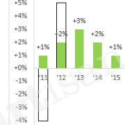
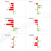
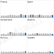
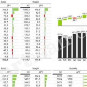
Labelling data points in charts is generally more reader-friendly than using a vertical axis. The axis is automatically displayed in Excel, and therefore it is often found in reports and presentations. However, it forces the chart reader to move their eyes back and forth between the data points and the axis.
If data points are labelled directly, on the other hand, the reader’s eye can rest steadily on the data points. That way, readers of your charts can concentrate on the content (!). Unfortunately, standard labelling options in Excel are often too inflexible, and the results are quite ugly. In line charts, for example, there are often overlaps between label and line, and in the worst case, they are no longer legible.
Excel does offer different label positions (top, bottom, right, left, centred). But these are always applied to all data points at once, although an individual alignment per data point would make more sense. Of course, you can also move the labels manually. But this can also lead to problems, as the manual position also needs to be changed by hand after data updates.
A little trick provides the solution: an invisible auxiliary data range can be used to generate data labels that always position themselves correctly. In the case of a line chart, you can have it calculate whether it ‘bends’ up or down for each point. The formula then compares each data point with the median value of its two neighbours. Of course, you may have to use completely different formulas for different chart types.
Use the following steps to create clever labels for line charts:
- Create a formula to move the label up (+1) or down (-1)
- Calculate auxiliary data range “Label” for data labelling (at the points level)
- Add data range “Label” to the diagram, make points and connecting lines invisible and insert centred data labels
- Click the first label field of the new data range twice (don’t double click), so that the individual label field is selected
- Type “=” and click on the table cell showing the value to be displayed (e.g. the value for January), then confirm with enter (this creates a so-called linked label)
- Link the other data points with the corresponding table cells
Done 🙂
Tip: Excel Version 2013 introduced the labelling option “Value From Cells”, with which you can achieve the desired result much quicker.


