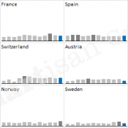
Illustrate variations
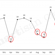
It´s mostly about variations when presenting data to decision makers, such as planned, target or empirical values. Only these variations allow us to reasonably evaluate the actual numbers.
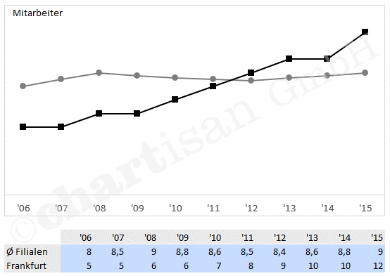
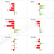
Variations should play a major role during the visualisation as well. Today´s trick shows us that this is feasible within Excel only with a few clicks in specific cases:
- Compile a diagram with two curve streams of data
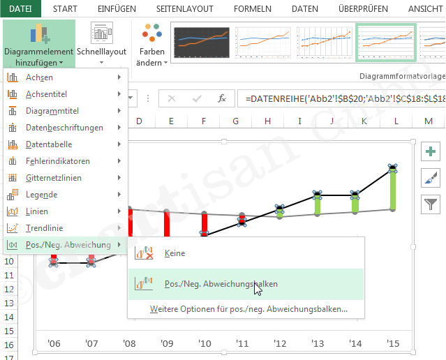
- Mark the diagram and add the variation columns by choosing the menu diagram draft
- Format the variation columns red or green respectively. The column width can be adjusted to one of the curve stream of data by right click. (parameter “space width”)
- Add data caption and legend if applicable (see our trick “captions”)
Finished 🙂

